Mount Holyoke library website
Mount Holyoke library website
I redesigned the website that improved library navigation experience for 2300 students and promoted awareness of Study Spaces by 10%.
COMPANY
Mount Holyoke College
Mount Holyoke College
ROLE
UX/UI Designer
TASK
Research, competitive analysis, sketching, UI design, prototyping, user testing
Research, competitive analysis, sketching, UI design, prototyping, user testing
DURATION
Jan - May 2018 (4 months)
Jan - May 2018 (4 months)
"This room is packed. Where do we go to study now?"
"This room is packed. Where do we go to study now?"
Overview
Overview
I've heard a lot of these complaints at school. Mount Holyoke College students are unaware that they can use the Study Spaces webpage to navigate in the library. The existing page was poorly designed and it took many clicks to find, thus no one was using it.
To help find the study spaces that best fit a student’s need, I and another student redesigned the webpage to give students a room-finding experience. My role in this project was UX researcher and UX designer.
User Research
USER INTERVIEWS
First, we conducted the initial in-person interviews around the LITS library complex. There were 18 participants representing a wide variety of majors and class years.
STAKEHOLDER MEETING
We met with a core library staff to identify the business requirement as “To Increase the students’ awareness of the Study Spaces and present the available resources to the students.”
INTERVIEW INSIGHTS
To our surprise, the students don’t desire a better reserving system. They want a page that represents all study spaces. Thus, we decided to shift our focus to create a filter page with all study spaces, and each space with its own page description.
HEURISTIC ANALYSIS
While processing the initial interviews, we conducted a heuristic analysis on other maps and library system. We borrowed the use of icons to represent the library resources from UCLA and Smith's library website.
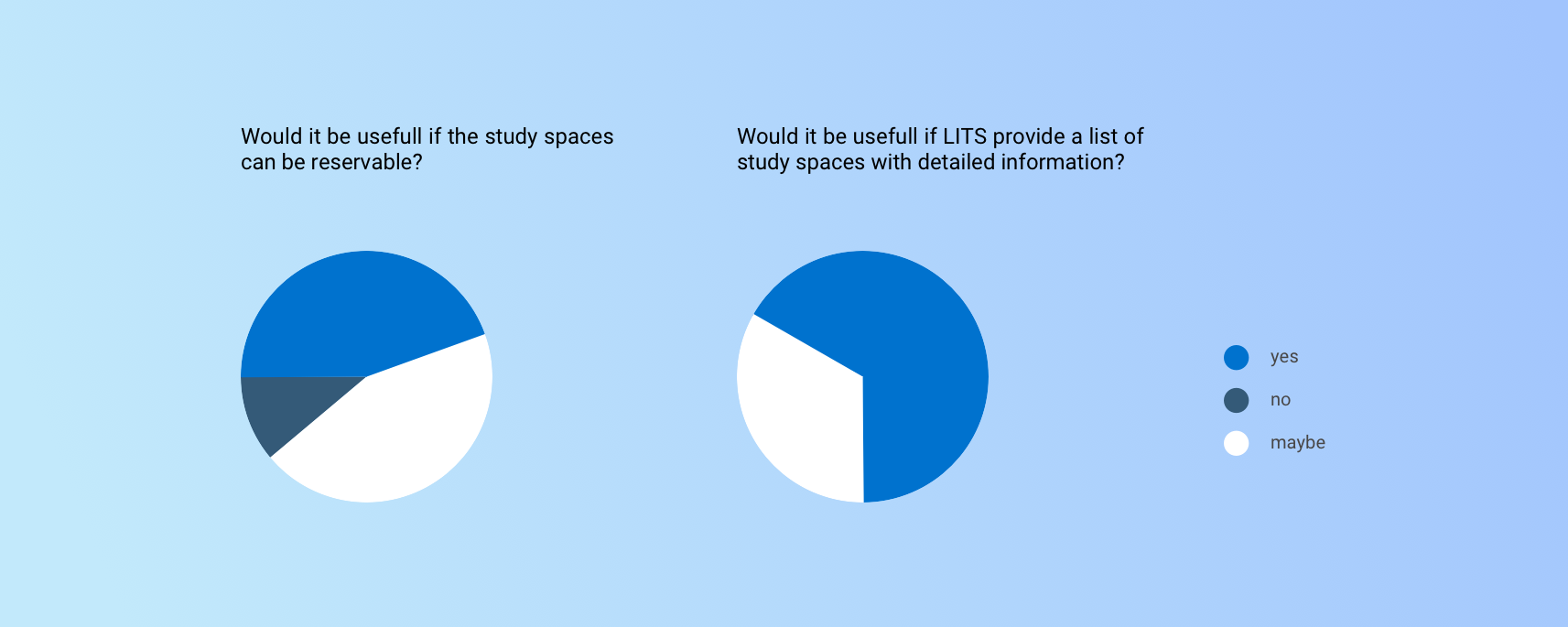
The key survey question that changed our design direction
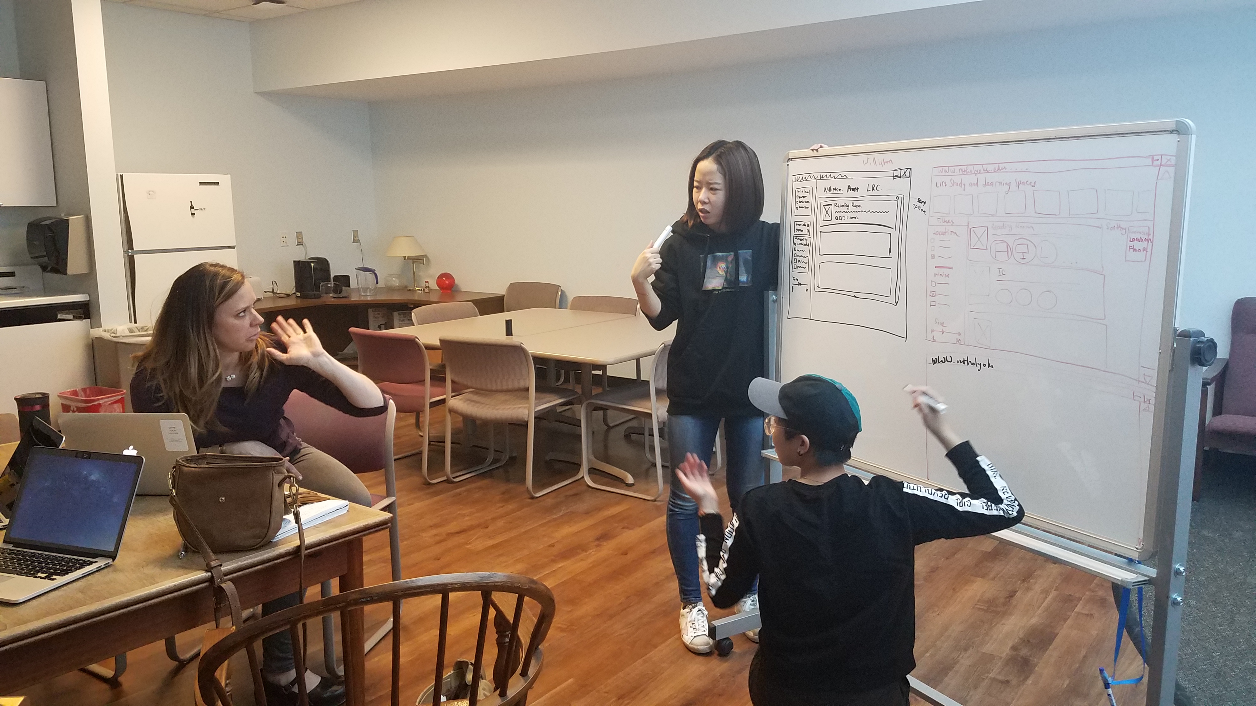
Met with the stakeholder and presented our discovery results
Students want a page that represents all study spaces, not a better reserving system as we anticipated.
Personas
Using the insights from user research, we decided we would need personas. Thus, I synthesized three personas to guide us through. Becca, Sara, and Wendy resemble students with different class years, study habits and library usage habits. I would always remember how they use the study spaces. We referred to them throughout the entire product development process.
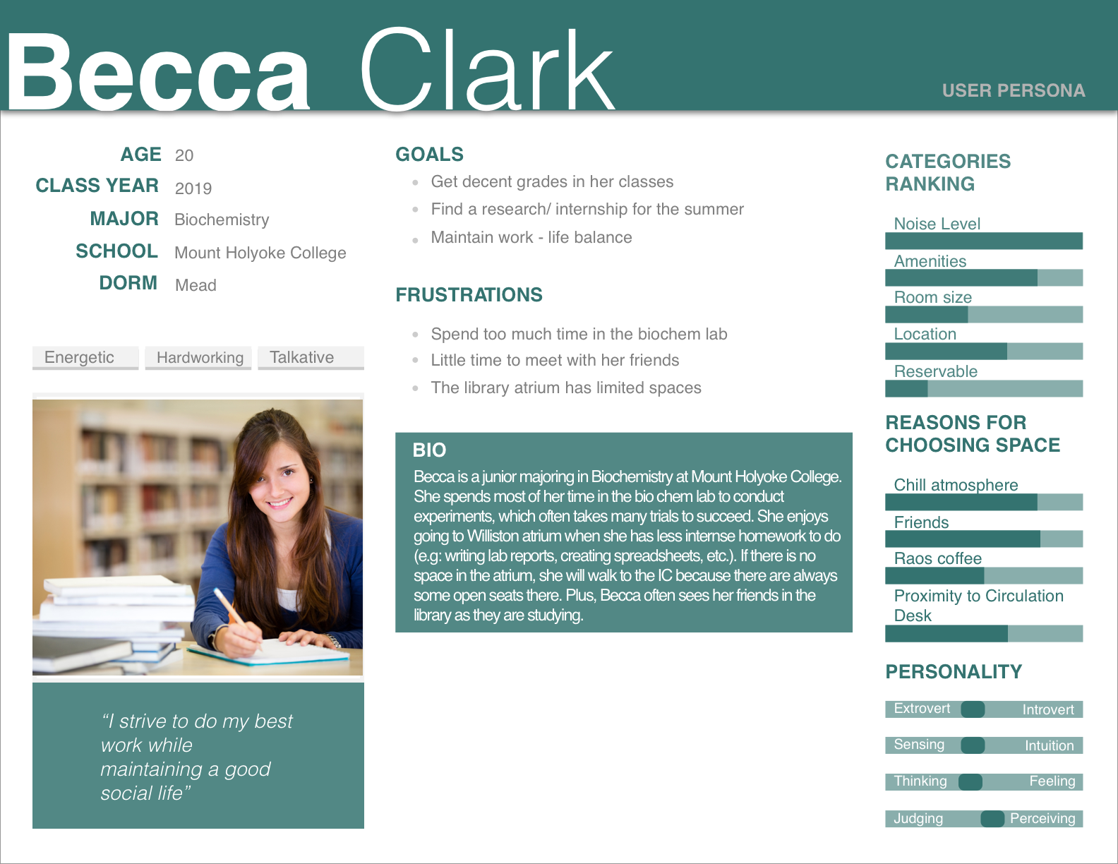
Becca normally spends a lot of time in her biochemistry lab. She tries to go to the library whenever she has less intense homework to do, because she can socialize with her friends at the same time. Becca prefers open spaces where she is allowed to talk.
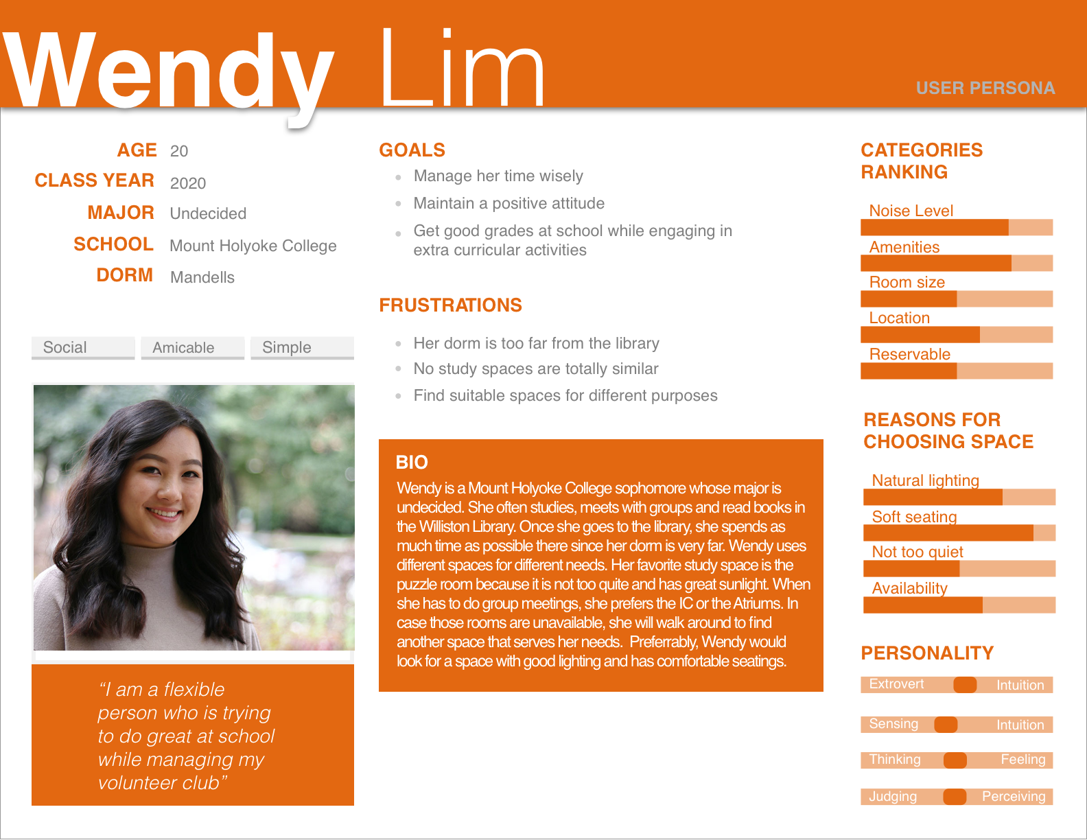
Wendy's dorm is far from the library, so everytime she visits the library, she would utilize her time as much as possible. Wendy prefers different room for different study purposes, such as the IC for group meetings and individual room for writing essays.
Wendy's dorm is far from the library, so everytime she visits the library, she would utilize her time as much as possible. Wendy prefers different room for different study purposes, such as the IC for group meetings and individual room for writing essays.
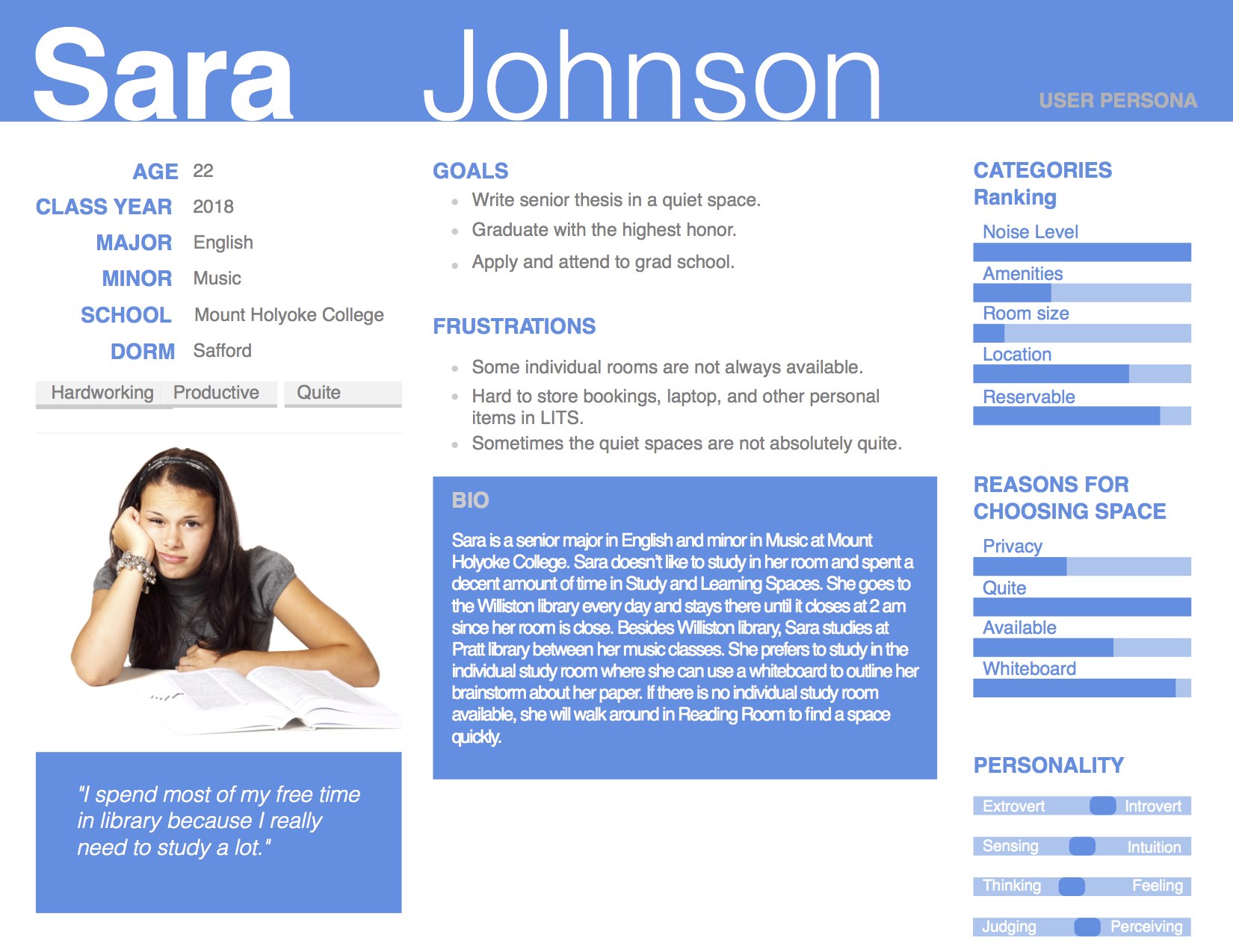
Sara is a senior writing her thesis. Her schedule is intense and she always studies in small, individual room. Sara needs a quiet space that has a whiteboard so that she can quickly brainstorm her paper.
Important findings
Thanks to the personas and user research results, we were able to see that both big, open spaces and small, individual rooms were equally important to the users. Depends on the goal of each student at a specific time, they would find different rooms in the library to study. Thus, it was our job to present all the rooms and their resources to our students.
Sketches
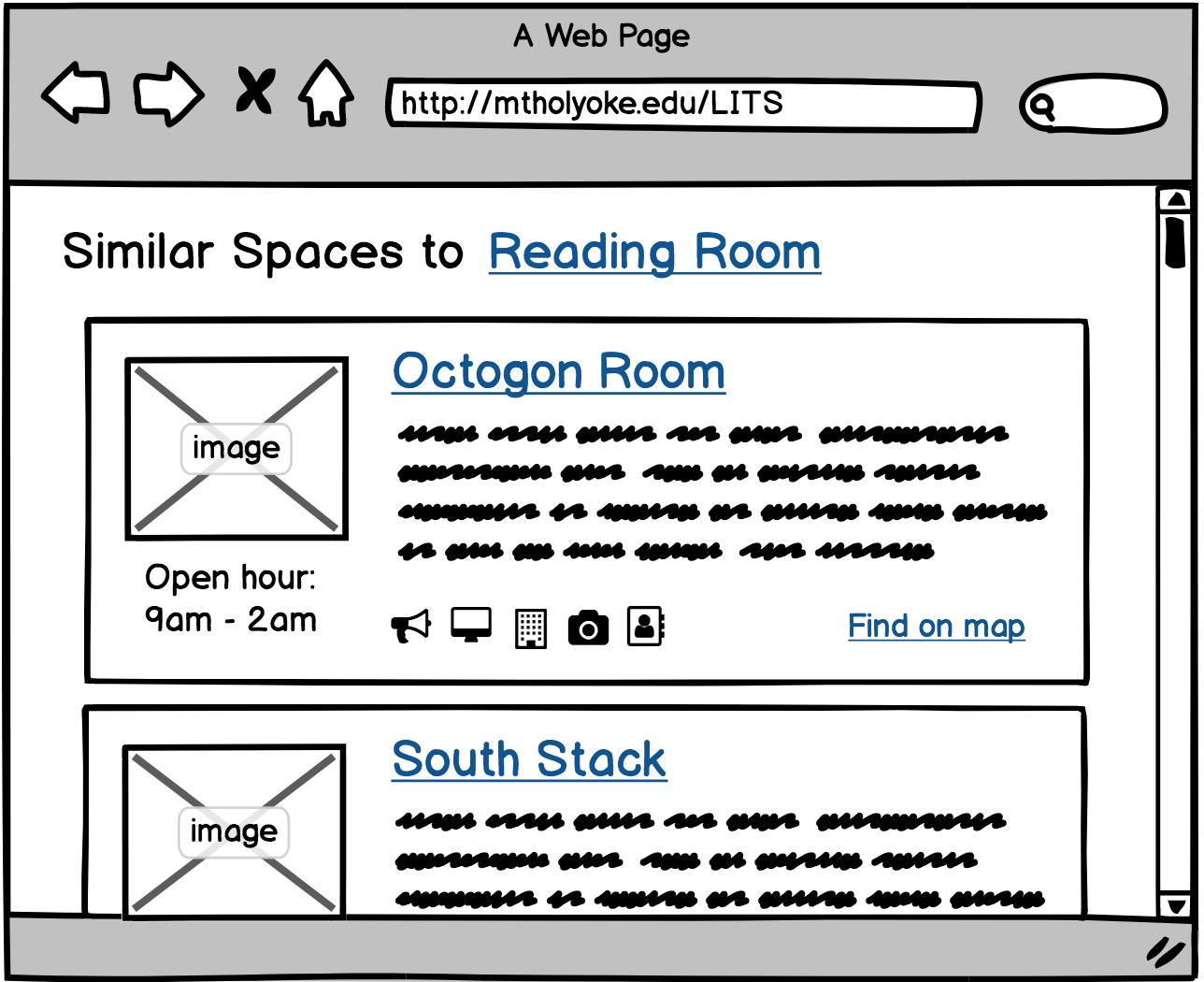
I usually start the design process with low fidelity sketches. This is the way I iterate through many design options quickly. The main purpose of sketches was to brainstorming different ideas and layouts. I and my teammate each sketched on our own, then sat to compare the ideas. We both picked the layout that showed full details of a room, including a big photo on top, with hours and resources coming afterward.
After having the sketches, we met with the main developer to represent our draft and to confirm the coding constraints. Thus, we made a decision to reduce icon usage. We discussed and all agreed that using around 15 icons for different features would be misleading and hard to code. I tailored the icons to only represent noise level, wheelchair accessible, and the top 3 important resources.

Interaction Design
To quickly generate the design from initial research, we created wireframes that demonstrate the key pages. From this moment, I and my teammate took on different sections of the project. I focused on the room information and interaction map, while she took care of the filter page.
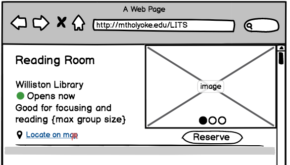
IMPORTANT INFORMATION FIRST

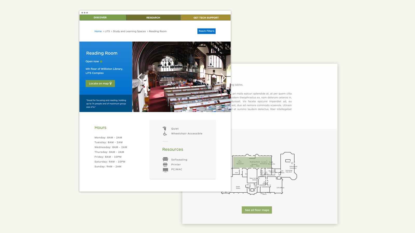
The main screen has been designed to allow users quick access to primary details of the room. It shows how the room looks like, whether it was open or not, and a little suggestion for the perfect room use. The suggestions go a long way since they can help users choose a room more quickly.
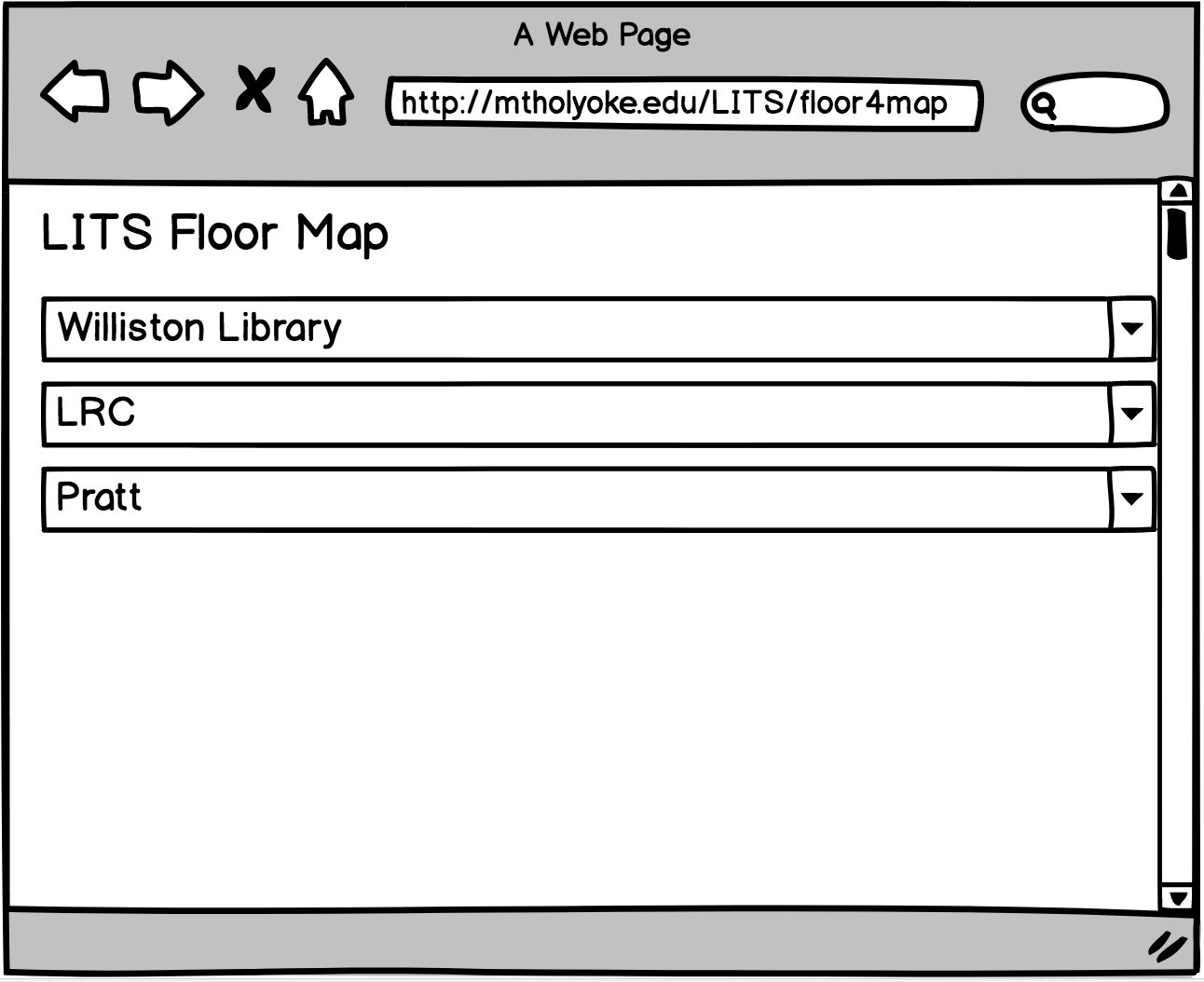
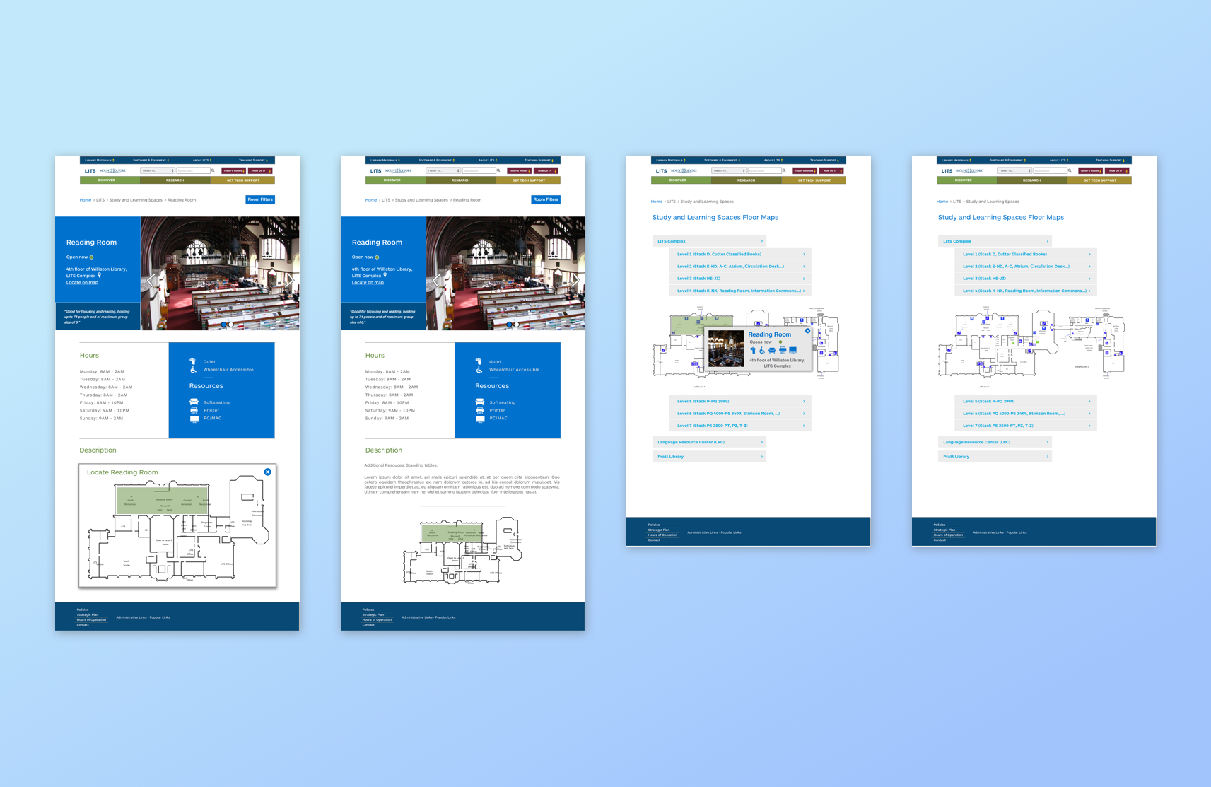
INTERACTIVE MAP
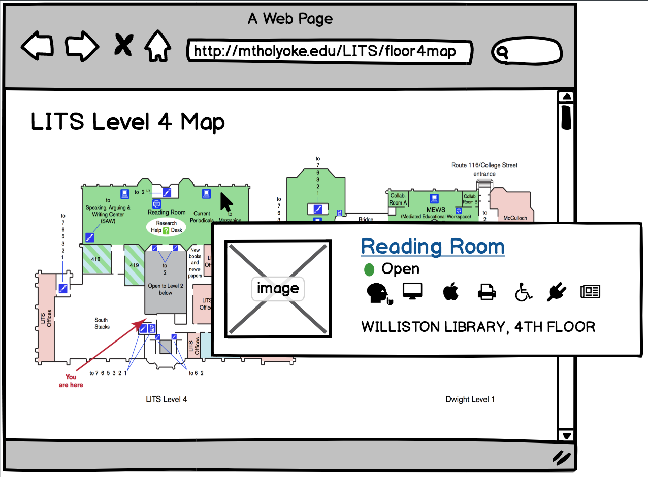
Our library has 3 buildings and the main building has 7 floors with secret corners. I myself have never explored all 7 floors of LITS. Thus, I decided to include an interactive map to help new students navigate the library based on each floor level.
Here, the rooms are color-coded based on their noise level. When the user hovers over a room, it shows a snippet of that room with some most important information (whether it is open or not, where it is located and what resources the room has).
UI Design
After identifying the color scheme and fonts based on the original school website, we created hi-fi designs and identified the major screens. I used Sketch for the UI design. We chose to incorporate UI before running a test because it creates a "real" feel to the screens and users would feel more comfortable interacting with the new design.
Since this page was a part of the Mount Holyoke College website, I needed to follow the existing design guidelines from the school. With blue as the primary color, the look and feel of the design should be rather simple and professional.
THE COLORS
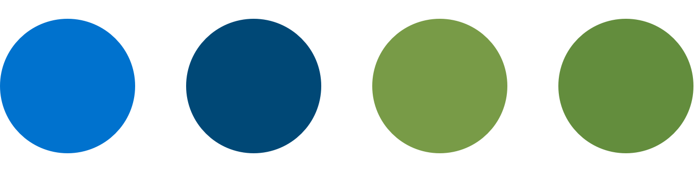
As stated, we used a set of blue and green from the Mount Holyoke College design guidelines. Since these color doesn't contrast with each other much, I carefully used black and white texts for accessibility issue.
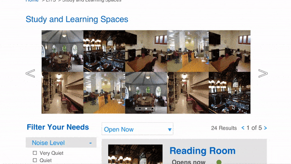
THE ICONS
In the design, we used icons to help users scan through details of a room. We selected a set of icons from the Noun project. These icons presented noise level, main resources in the room and wheelchair accessibility.
USING THE GOLDEN RATIO
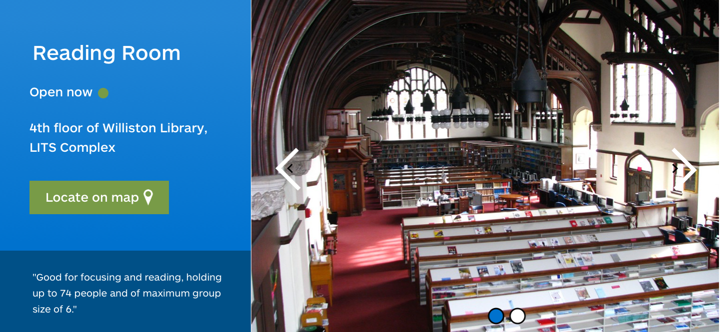
I designed the top section of the room details page following the golden ratio shape. The goal was to create a balanced layout while guiding the eyes of the users to read the information on the page.
Prototyping
After getting together the UI design, I created a prototype for testing purposes. I used Invision as the main tool as it was easy to collaborate and give feedback on a team. Throughout the process, I learned how to use hotspot, a great InVision feature to make prototyping much easier and faster.
Usability Testing
Before launching the product, I've made a testing round in order to reveal possible usability problems. To better understand how users interact without new design, we created an unmoderated test using Loop11. We recruited 8 students to participate and received 5 valid responses. The goal was to test the clarity of components and user efficiency. We broke out our key performance indicators into tasks that could be clearly measured. The participants gave great feedbacks including some issues for us to tackle in the future.
- "Oh this is clickable?"
- "That was easy!"
- "How do I get to the map?"
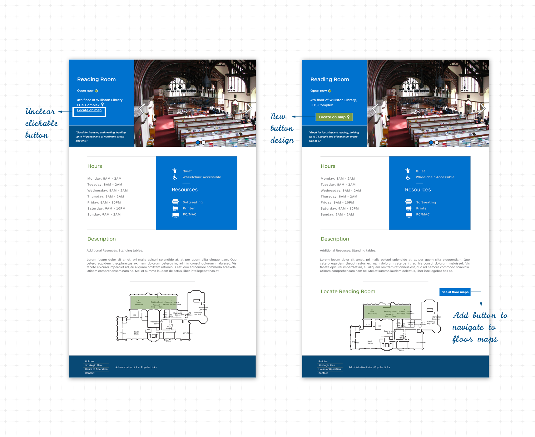
Issues discovered through testing and changes made
Final high fidelity design
Reflection
From this project, I learned the end-to-end process of UX Design which was entirely user-focused. The school launched the project in August 2018 (you can find it here!), helping 2300 students navigate the library spaces more easily. The new design increased students' awareness of the study spaces by 10%, which satisfied our stakeholder's requirement.
The biggest challenge I faced was time management since I spent at least 10 hours/ week for the project while taking 4 4-credit classes. I divided the weekly tasks into smaller sections and worked on each section whenever I have free time. I and my teammate worked separately and met at least once a week to sync our progress. I found this method work really well for me, which empowered my future teamwork approach.
If I can do this project all over again, I would work more closely with the developer to ensure the design to be programmed correctly. In addition, I would make sure I and my teammate were following the same design guidelines, as our final design had different font weights and sizes.
Selected Works
Adaptive CardsPlatform design
Integrating Copilot to Teams EventsAI explorations
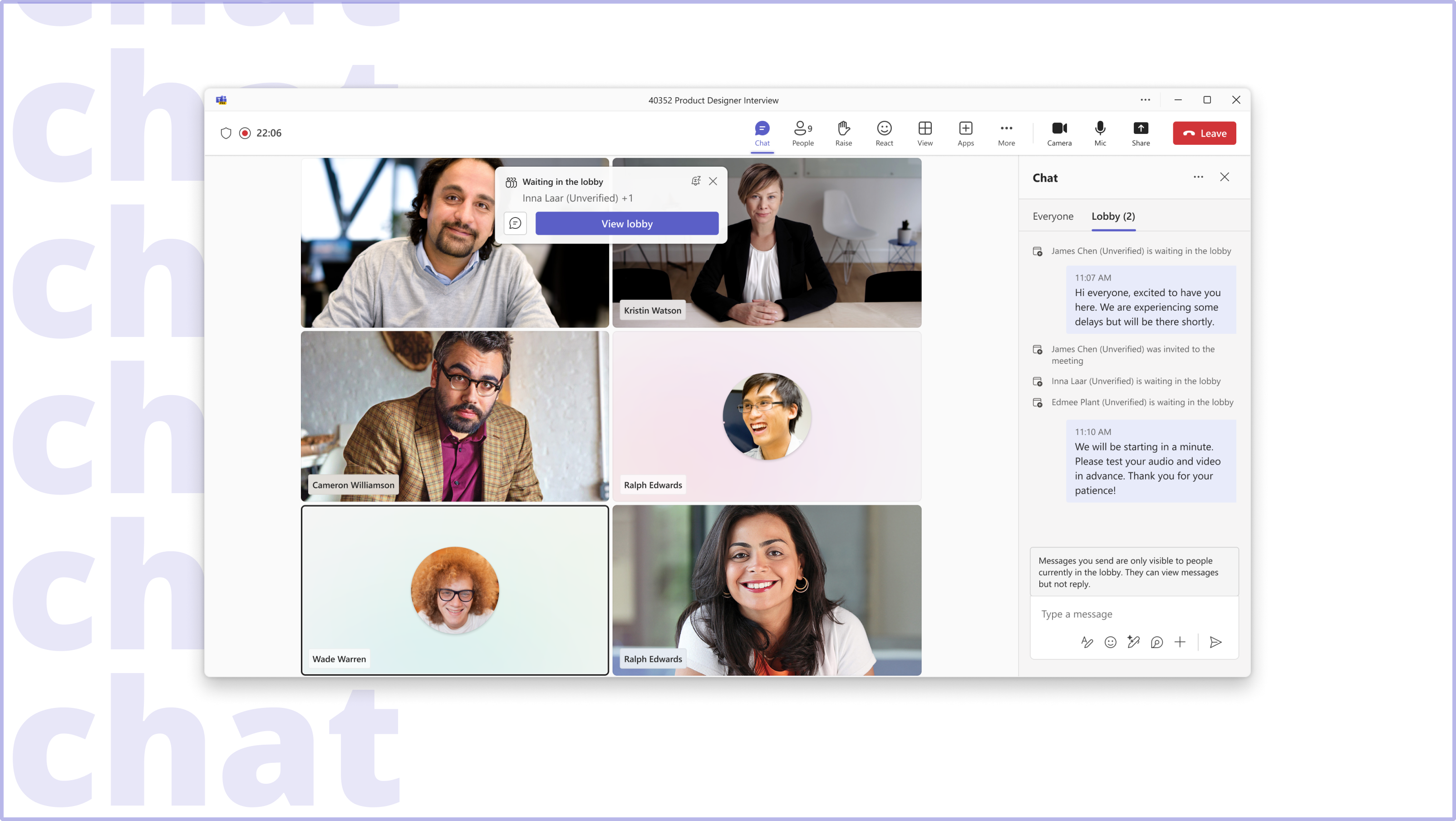
Lobby chatUX design
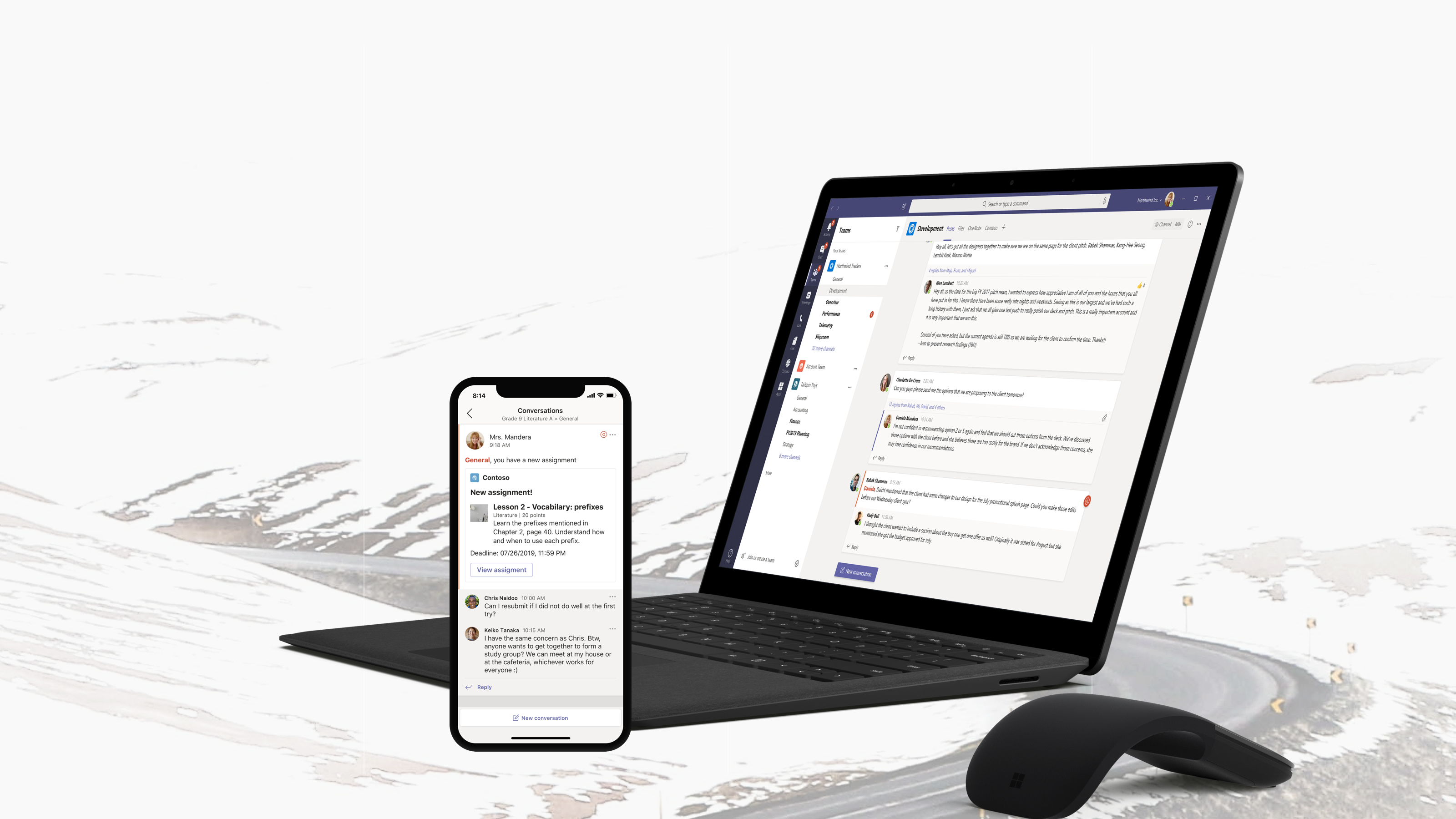
Partner apps in TeamsProduct design with Teams Platform
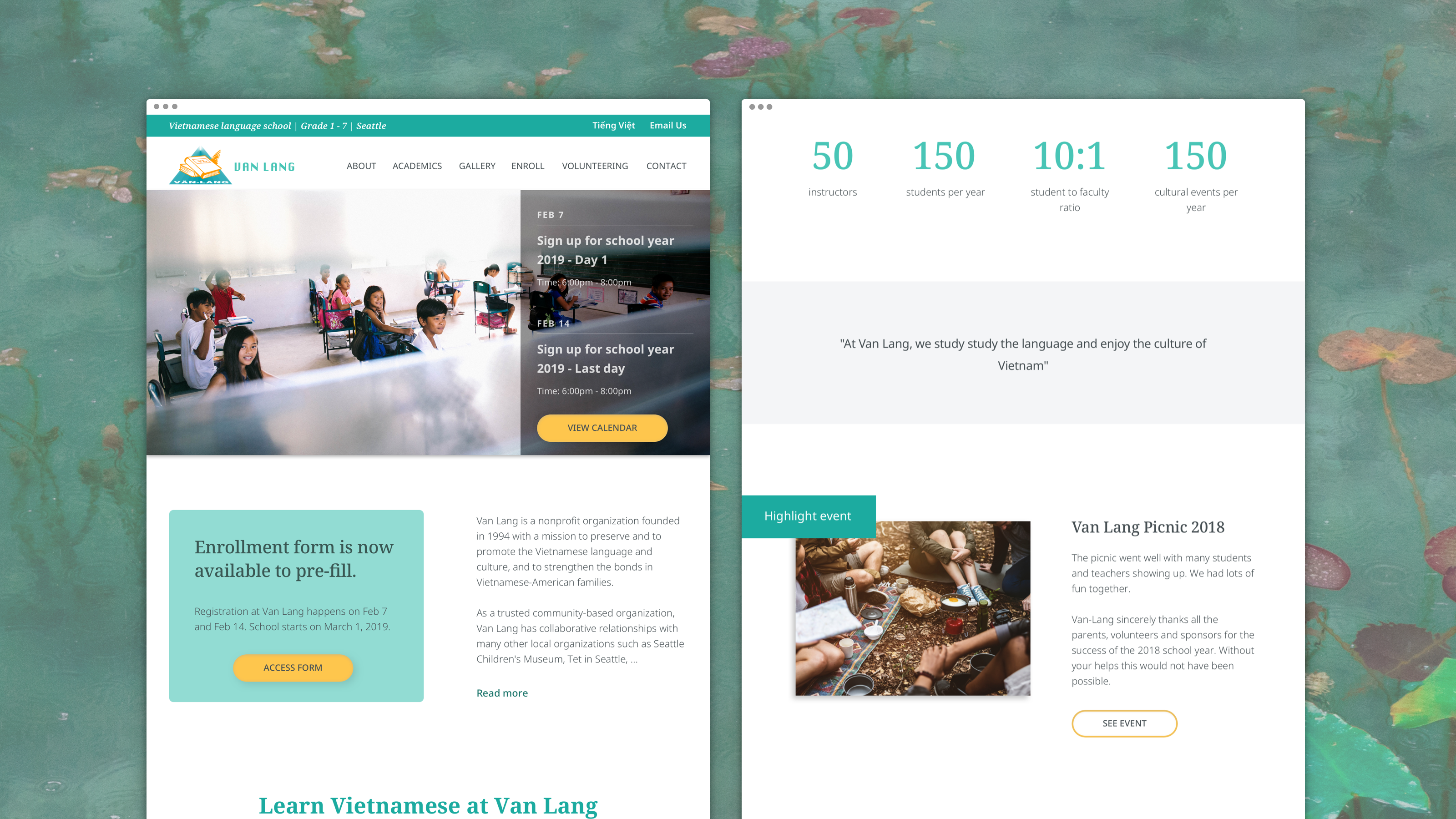
Van LangVietnamese school website redesign
LITS LibraryLibrary website redesign
© 2024 Tien Dao
Email: tiendaothuy@gmail.com
Email: tiendaothuy@gmail.com
Email: tiendaothuy@gmail.com
Tel: (413) 313-8574
Tel: (413) 313-8574
Tel: (413) 313-8574