Card framework
Card framework
Cards are an open exchange format enabling developers to exchange UI content in a common and consistent way. In build today within Microsoft Teams, 6 card types are rendered differently across the board. The goal of this project is for every card to use the same visual language so that regardless of the device or the magic happening on the backend, the difference is invisible to users.
I owned the project and redesigned the card framework in both desktop and mobile under the guidance of a senior designer.
COMPANY
Microsoft Teams
ROLE
Product designer
TASK
Product design, visual design, wireframe, redlines.
DURATION
June - July 2019 (1 month)
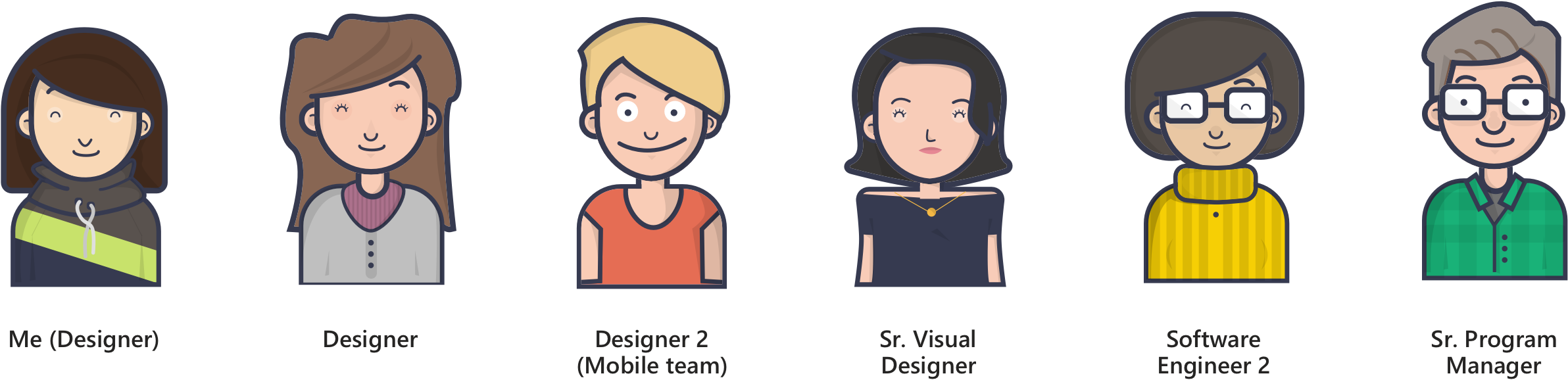
The A-team
The A-team
The A-team
The A-team
The A-team
I worked in a team of Sr. PM, Engineers, an Designers. Working with a cross-functional team was a great advantage in terms of getting quick feedback from the product team and stakeholder, it helped things move quickly and create impactful designs.
I worked in a team of Sr. PM, Engineers, an Designers. Working with a cross-functional team was a great advantage in terms of getting quick feedback from the product team and stakeholder, it helped things move quickly and create impactful designs.
I worked in a team of Sr. PM, Engineers, an Designers. Working with a cross-functional team was a great advantage in terms of getting quick feedback from the product team and stakeholder, it helped things move quickly and create impactful designs.
I worked in a team of Sr. PM, Engineers, an Designers. Working with a cross-functional team was a great advantage in terms of getting quick feedback from the product team and stakeholder, it helped things move quickly and create impactful designs.
I worked in a team of Sr. PM, Engineers, an Designers. Working with a cross-functional team was a great advantage in terms of getting quick feedback from the product team and stakeholder, it helped things move quickly and create impactful designs.
What are cards?
What are cards?
What are cards?
What are cards?
What are cards?
In this card framework, there are 2 categories of cards that I'm refering to: Adaptive cards and templated cards.
Adaptive card is an open card exchange format that allows developers to describe content as a simple JSON. Templated cards include hero, thumbnail, list, carousel, connector and digest card, of which designs are already determined in the system. While templated cards are convenient, adaptive cards is a lot more powerful and we recommend our partners to make the most out of adaptive cards. More information is available on the official adaptive cards website.
Project goals
Project goals
Project goals
Project goals
Project goals
1. Moving towards adaptive cards and redesign templated cards to match the look and feel
2. Introduce adaptive cards version 1.2 with media players and inline text input

3. Unify cards across devices (desktop, iOS and Android)
Adaptive cards redesign
Adaptive cards redesign
Adaptive cards redesign
Adaptive cards redesign
Adaptive cards redesign
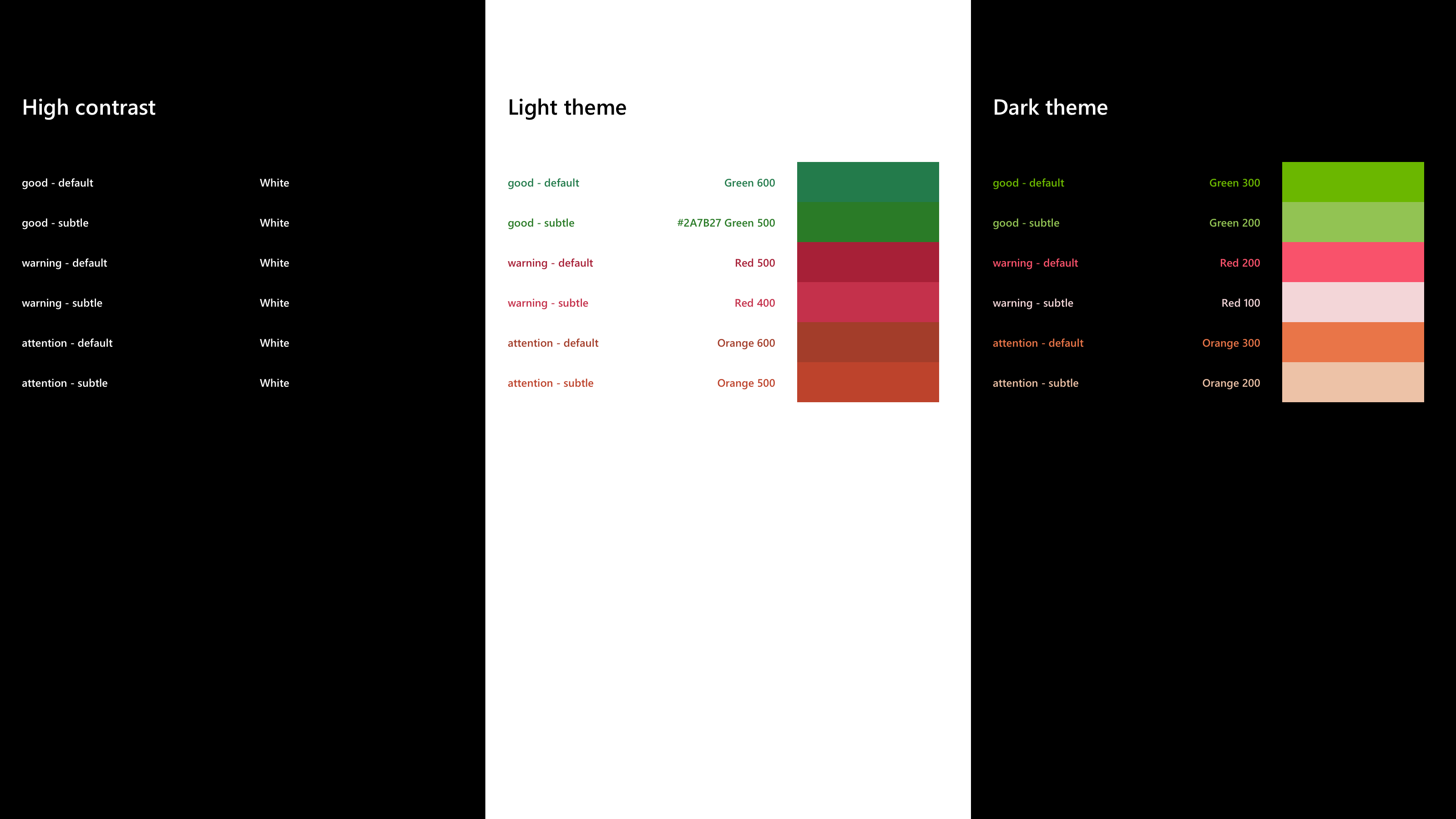
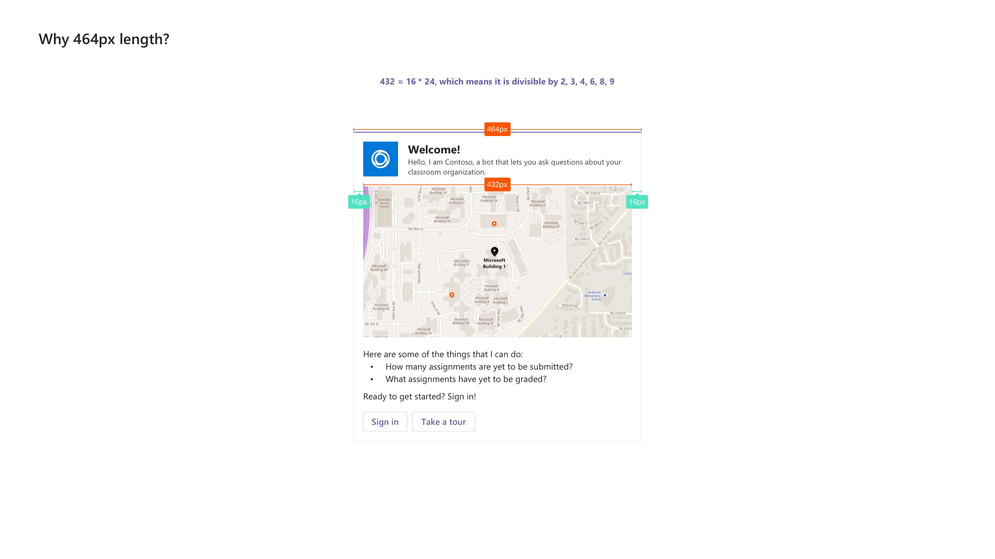
I updated adaptive cards visual system to align with current Teams visual style, including border width, padding, colors, card width, etc. With this system, all colors are accessible at 4.5:1 contrast ratio. I alsomade small visual tweaks for big improvements, such as in the card length below. A card of 464px length will work perfectly for many grid systems.
I closely followed the existing core design principles:
1. Semantic instead of pixel-perfect
1. Semantic instead of pixel-perfect
1. Semantic instead of pixel-perfect
1. Semantic instead of pixel-perfect
1. Semantic instead of pixel-perfect
2. Card Authors own the content, Host App owns the look and feel
2. Card Authors own the content, Host App owns the look and feel
2. Card Authors own the content, Host App owns the look and feel
2. Card Authors own the content, Host App owns the look and feel
2. Card Authors own the content, Host App owns the look and feel
3. Keep it simple, but expressive
3. Keep it simple, but expressive
3. Keep it simple, but expressive
3. Keep it simple, but expressive
3. Keep it simple, but expressive
4. When in doubt, keep it out
4. When in doubt, keep it out
4. When in doubt, keep it out
4. When in doubt, keep it out
4. When in doubt, keep it out
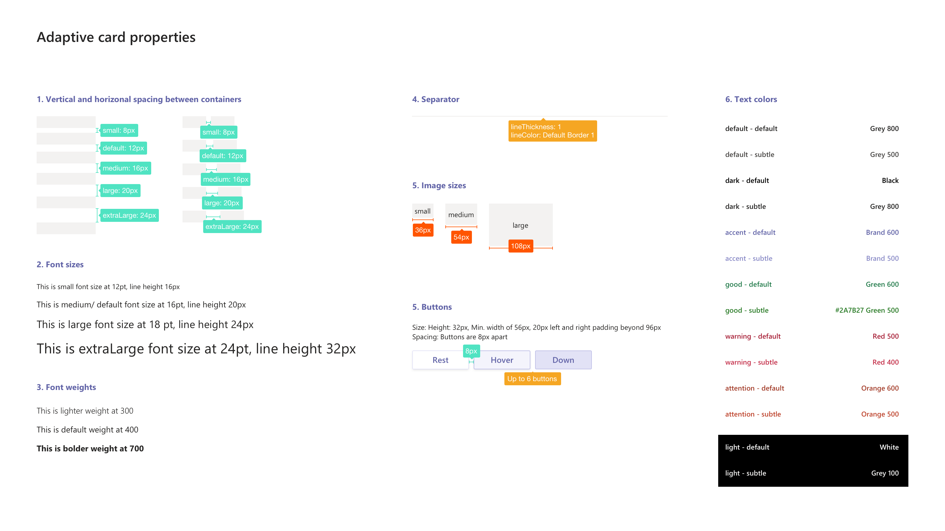
Example of the newly established visual system.
Example of the newly established visual system.
Example of the newly established visual system.
Example of the newly established visual system.
Example of the newly established visual system.
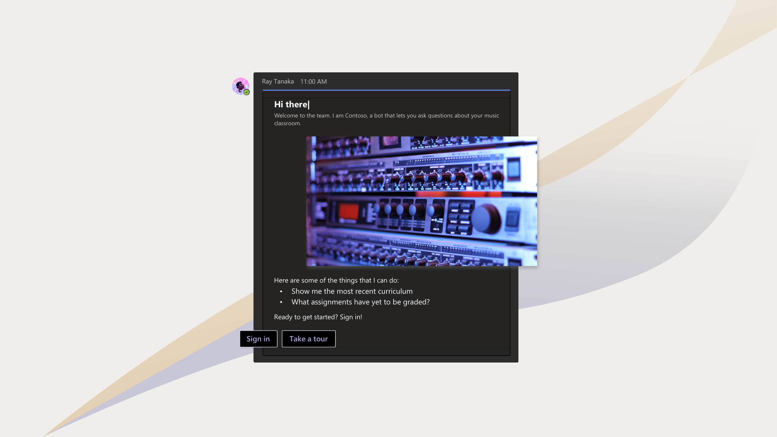
Adaptive cards 1.2
Adaptive cards 1.2
Adaptive cards 1.2
Adaptive cards 1.2
Adaptive cards 1.2
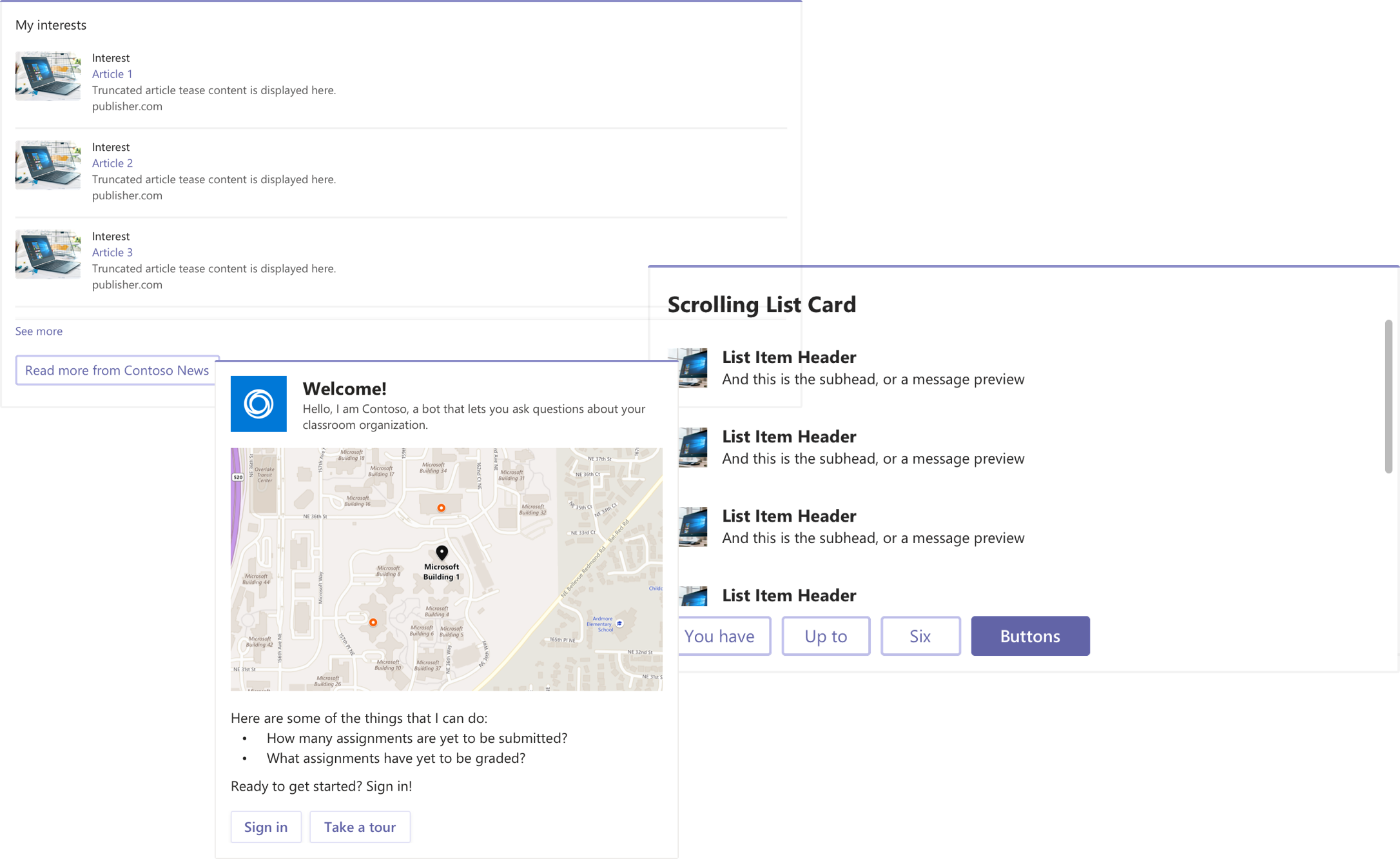
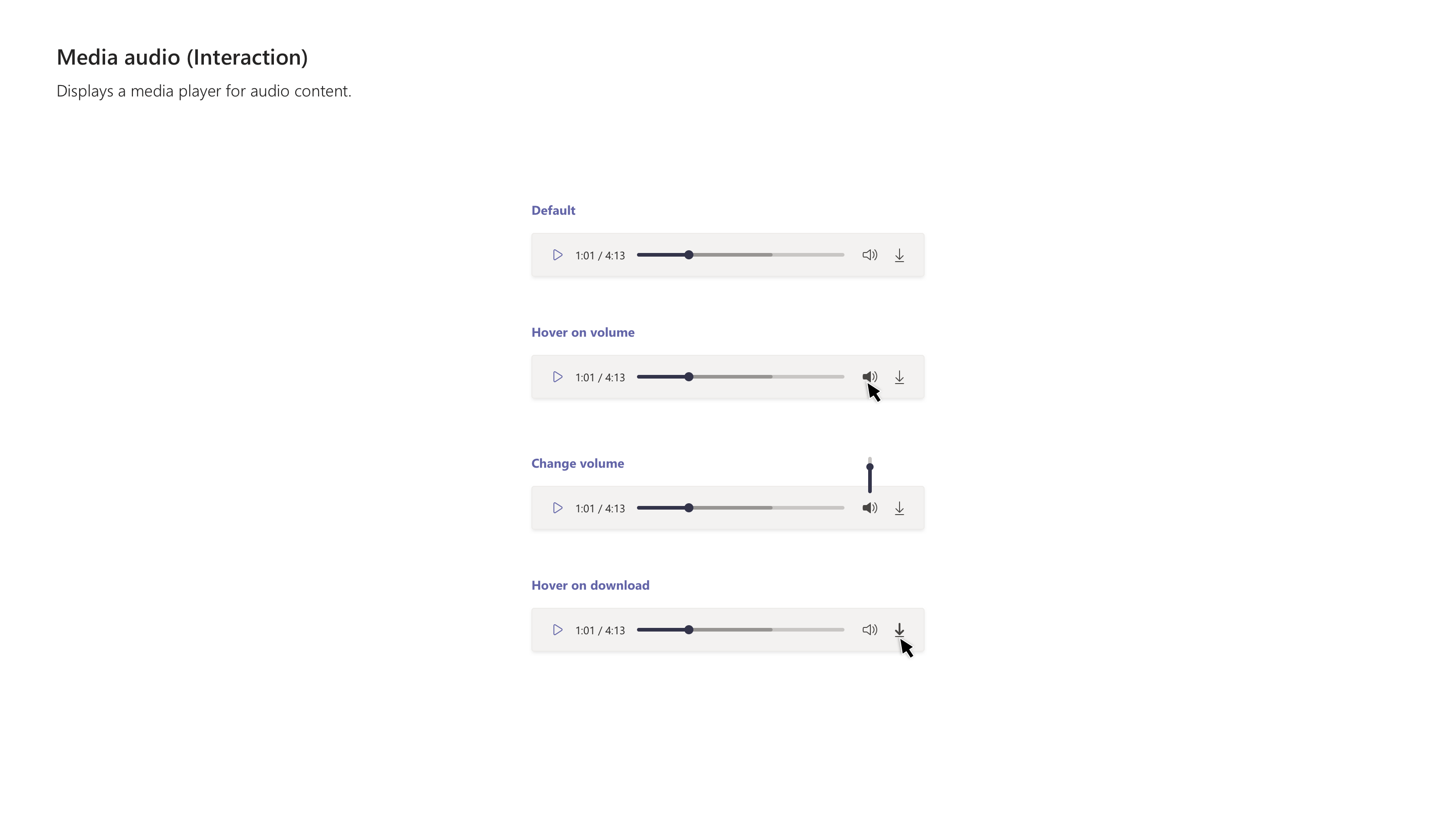
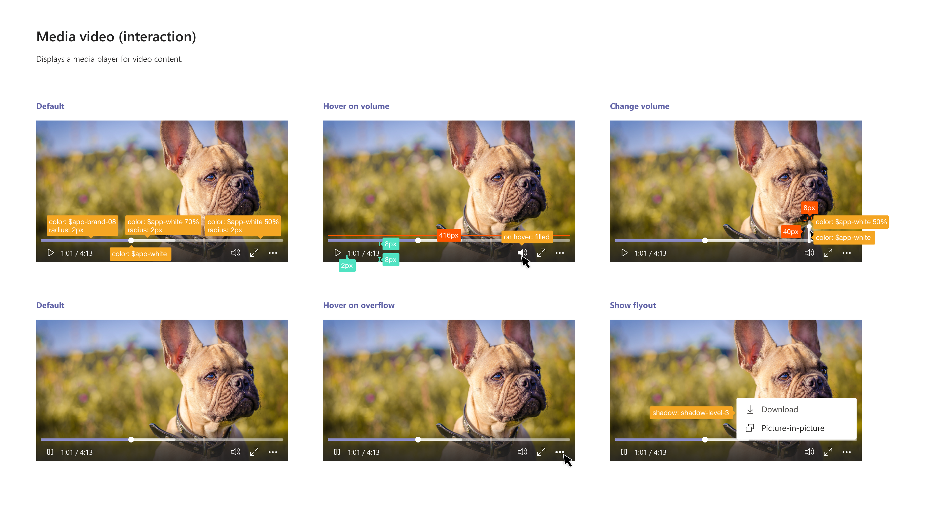
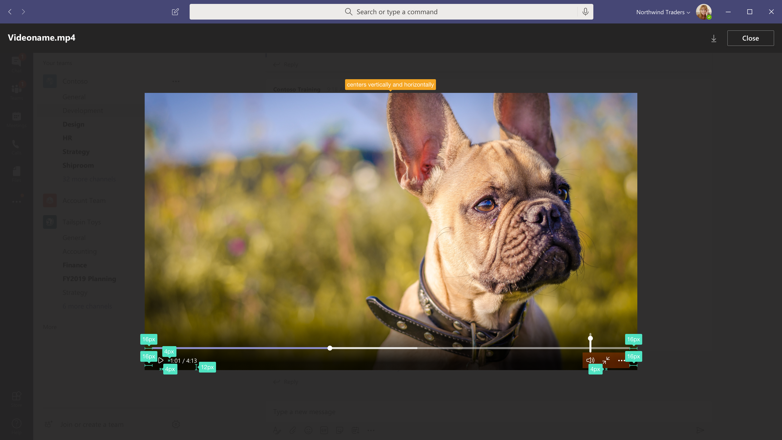
Redlines for the new features that will roll out with adaptive cards 1.2, including audio player, video player, and associated action on input text.
Redlines for the new features that will roll out with adaptive cards 1.2, including audio player, video player, and associated action on input text.
Redlines for the new features that will roll out with adaptive cards 1.2, including audio player, video player, and associated action on input text.
Redlines for the new features that will roll out with adaptive cards 1.2, including audio player, video player, and associated action on input text.
Redlines for the new features that will roll out with adaptive cards 1.2, including audio player, video player, and associated action on input text.
Templated cards
Templated cards
Templated cards
Templated cards
Templated cards
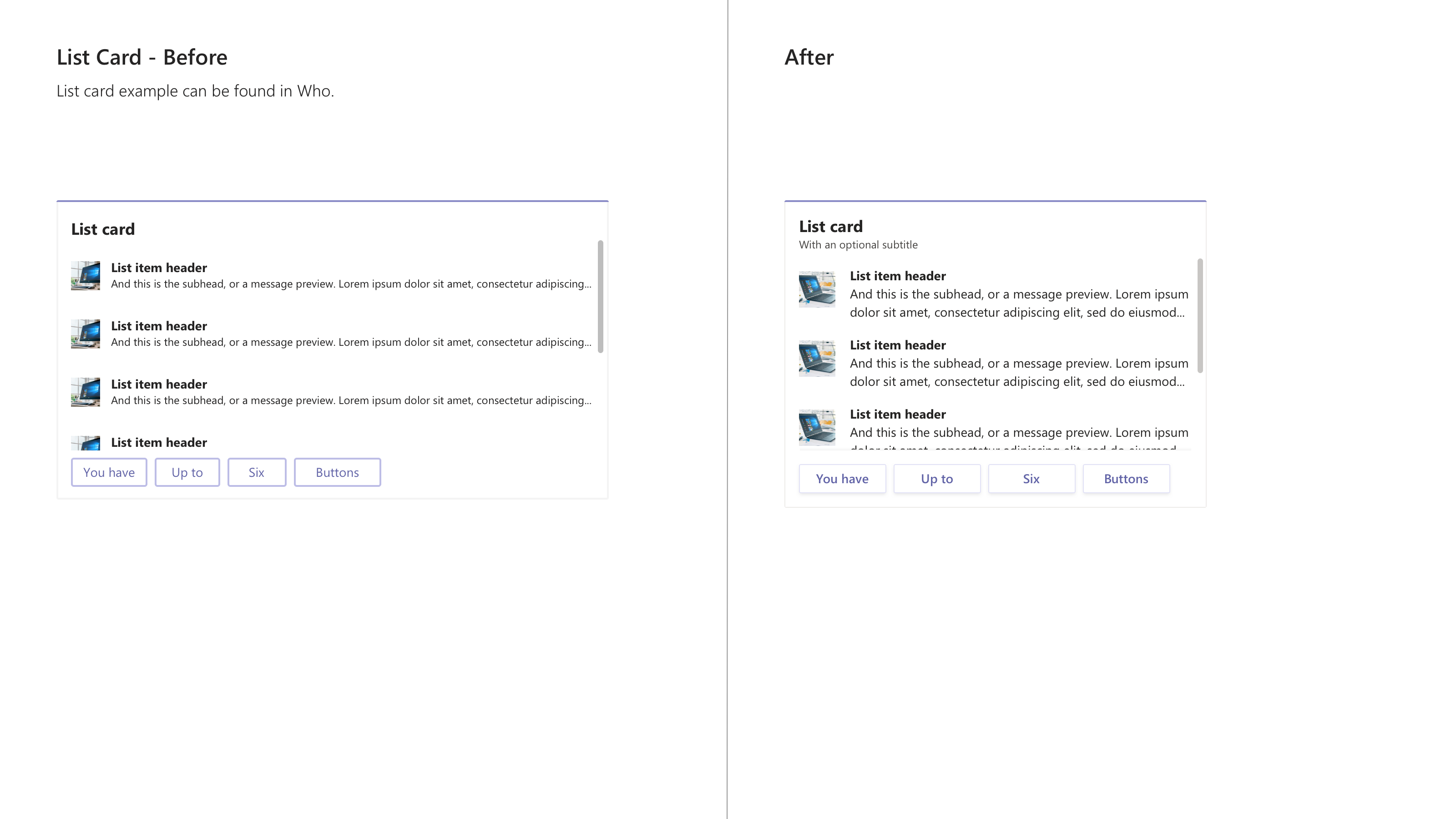
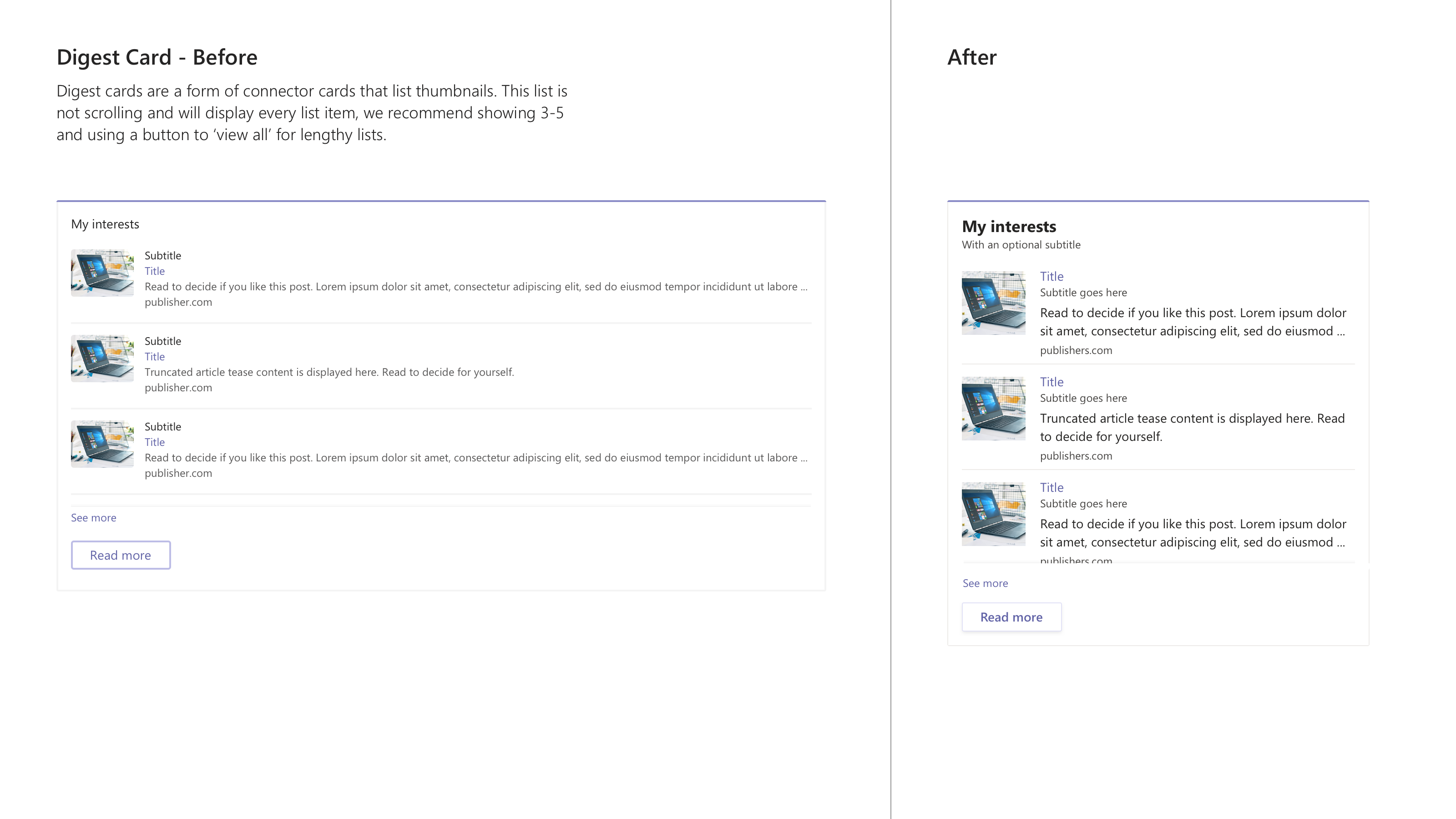
I unified 6 templated cards so that they align to the adaptive card visual language. Again, the goal is for users to experience the same look and feel across all card types.
I unified 6 templated cards so that they align to the adaptive card visual language. Again, the goal is for users to experience the same look and feel across all card types.
I unified 6 templated cards so that they align to the adaptive card visual language. Again, the goal is for users to experience the same look and feel across all card types.
I unified 6 templated cards so that they align to the adaptive card visual language. Again, the goal is for users to experience the same look and feel across all card types.
I unified 6 templated cards so that they align to the adaptive card visual language. Again, the goal is for users to experience the same look and feel across all card types.
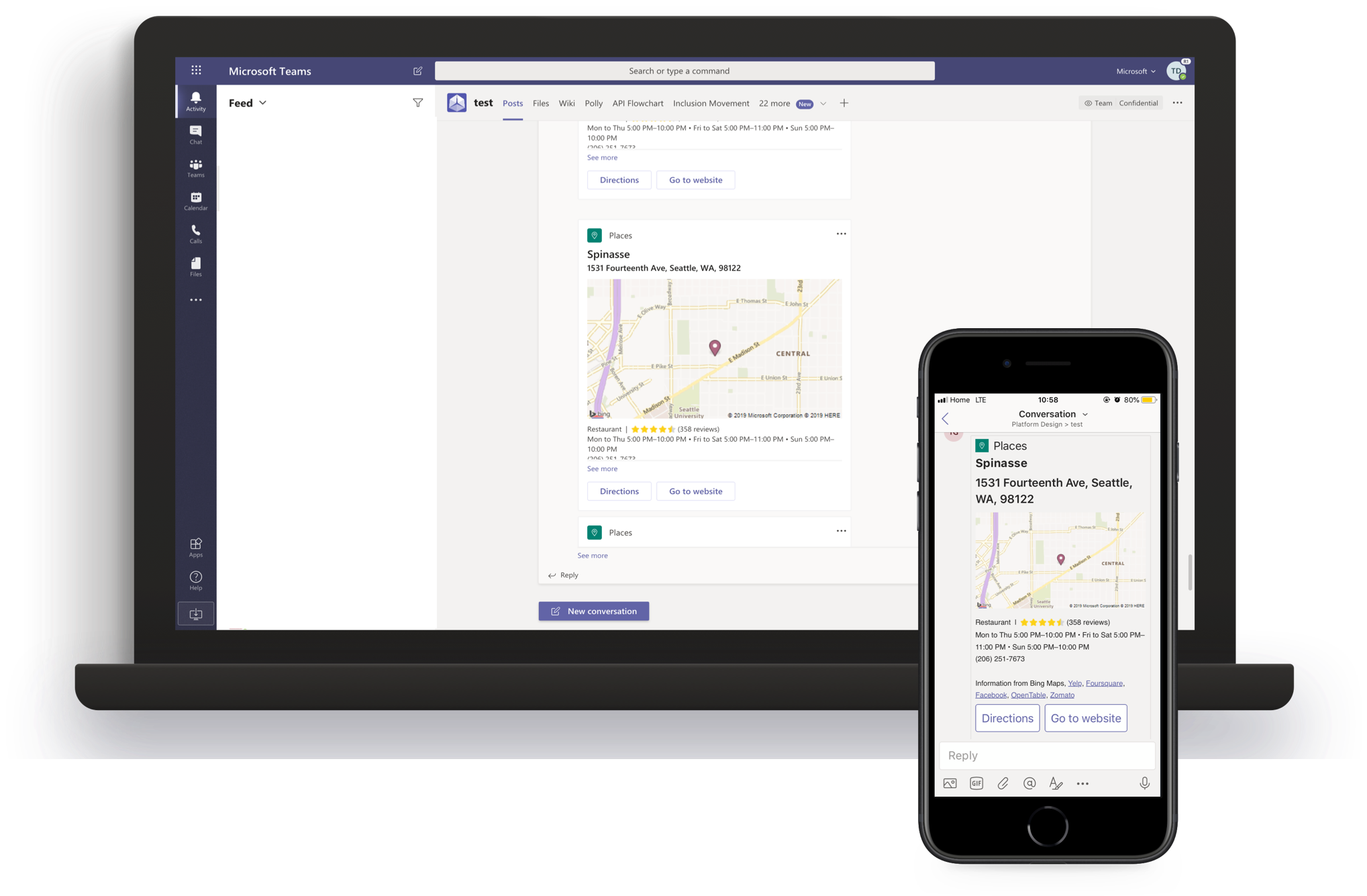
Mobile improvements
Mobile improvements
Mobile improvements
Mobile improvements
Mobile improvements
Before this project, there was no official visual system for mobile cards. The current mobile cards are tight with clunky spacing and patterns. I worked with the mobile design team to solidify the design system for these cards on iOS and android, while leaning towards native mobile experience.
Before this project, there was no official visual system for mobile cards. The current mobile cards are tight with clunky spacing and patterns. I worked with the mobile design team to solidify the design system for these cards on iOS and android, while leaning towards native mobile experience.
Before this project, there was no official visual system for mobile cards. The current mobile cards are tight with clunky spacing and patterns. I worked with the mobile design team to solidify the design system for these cards on iOS and android, while leaning towards native mobile experience.
Before this project, there was no official visual system for mobile cards. The current mobile cards are tight with clunky spacing and patterns. I worked with the mobile design team to solidify the design system for these cards on iOS and android, while leaning towards native mobile experience.
Before this project, there was no official visual system for mobile cards. The current mobile cards are tight with clunky spacing and patterns. I worked with the mobile design team to solidify the design system for these cards on iOS and android, while leaning towards native mobile experience.
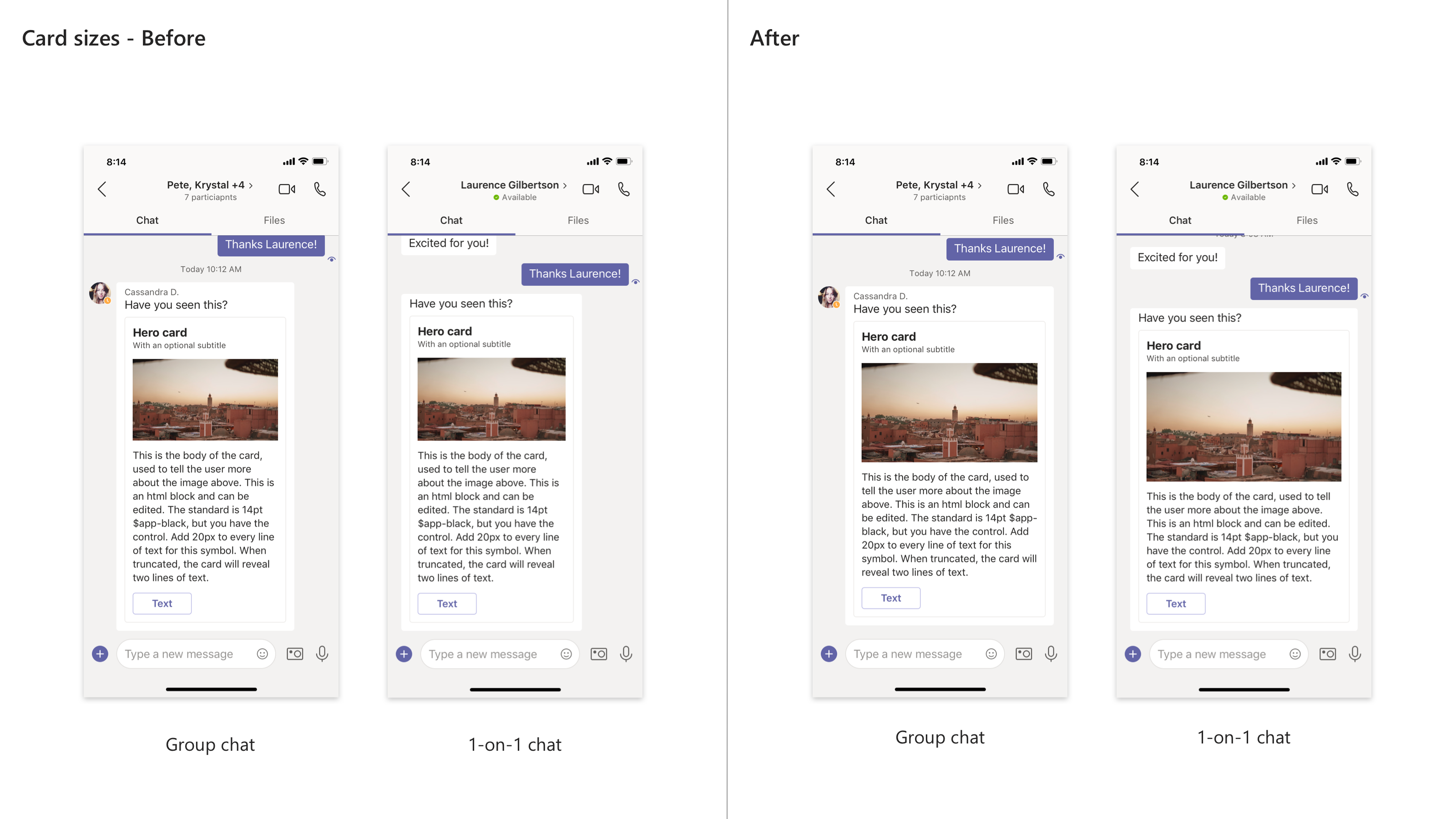
Since cards usually display rich information, I talked to the mobile designer and engineer to expand the width of the bubble chat just for cards.
Since cards usually display rich information, I talked to the mobile designer and engineer to expand the width of the bubble chat just for cards.
Since cards usually display rich information, I talked to the mobile designer and engineer to expand the width of the bubble chat just for cards.
Since cards usually display rich information, I talked to the mobile designer and engineer to expand the width of the bubble chat just for cards.
Since cards usually display rich information, I talked to the mobile designer and engineer to expand the width of the bubble chat just for cards.
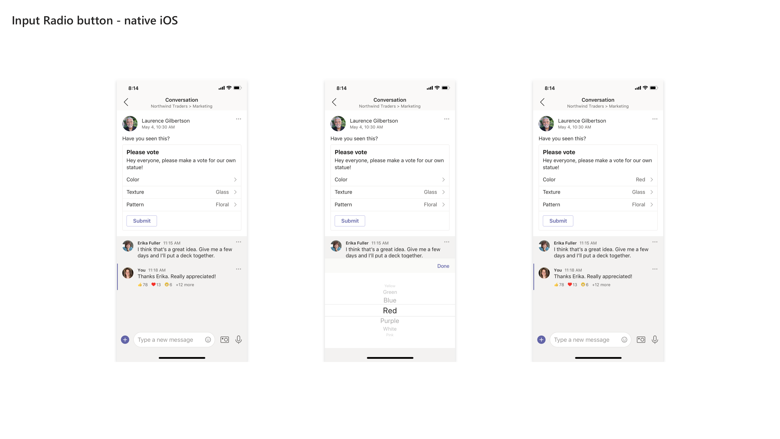
Preserving native iOS interactions
Preserving native iOS interactions
Preserving native iOS interactions
Preserving native iOS interactions
Preserving native iOS interactions
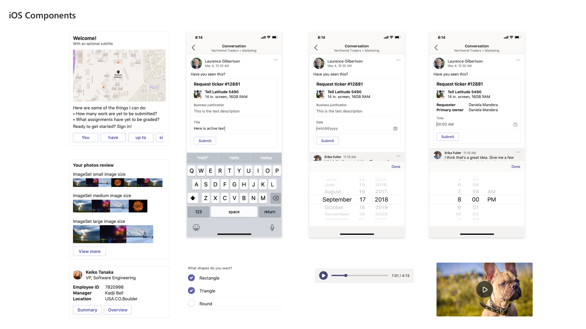
I mirrored the desktop components to both iOS and android.
I mirrored the desktop components to both iOS and android.
I mirrored the desktop components to both iOS and android.
I mirrored the desktop components to both iOS and android.
I mirrored the desktop components to both iOS and android.
Selected Works
Adaptive CardsPlatform design
Integrating Copilot to Teams EventsAI explorations
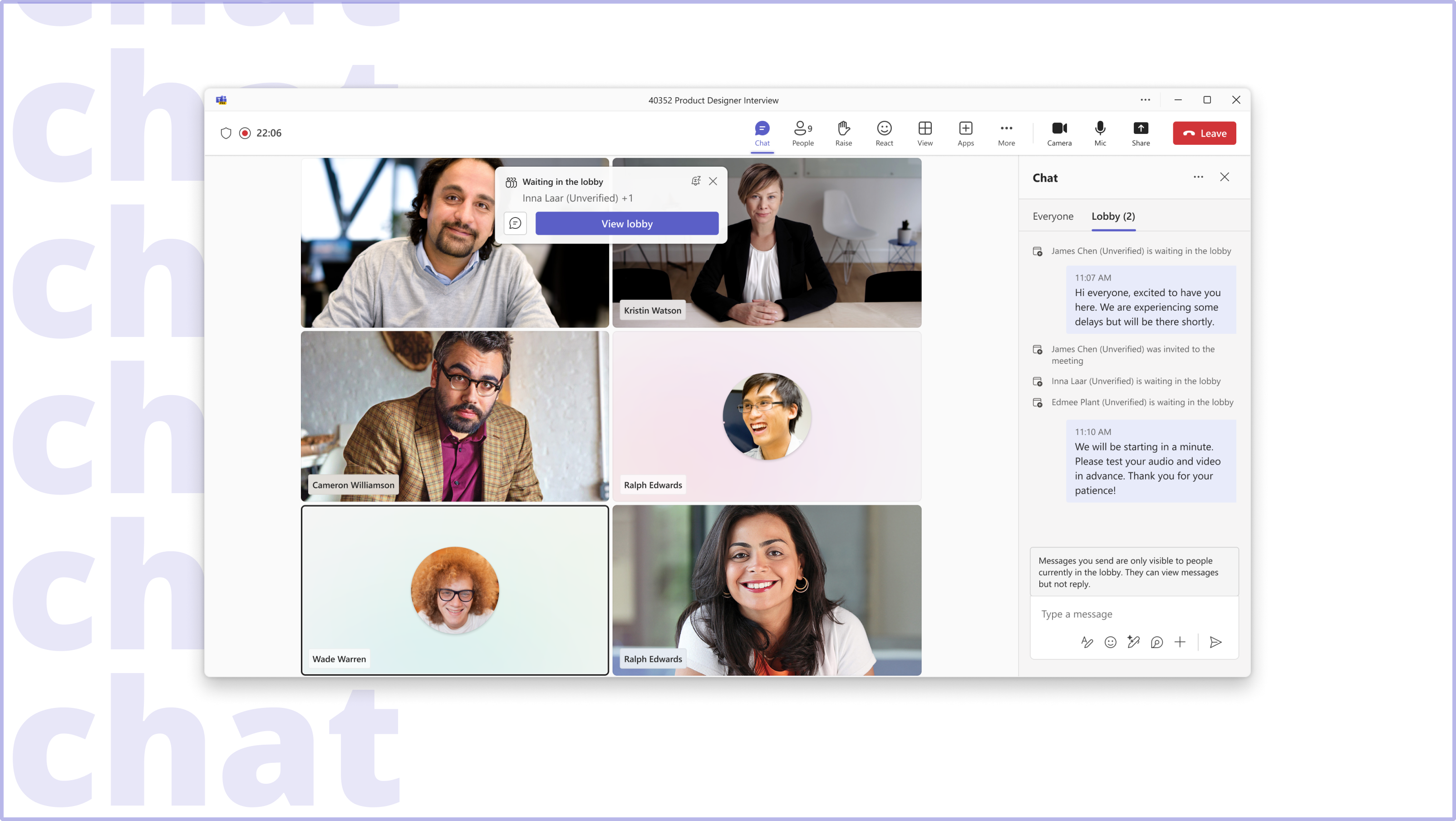
Lobby chatUX design
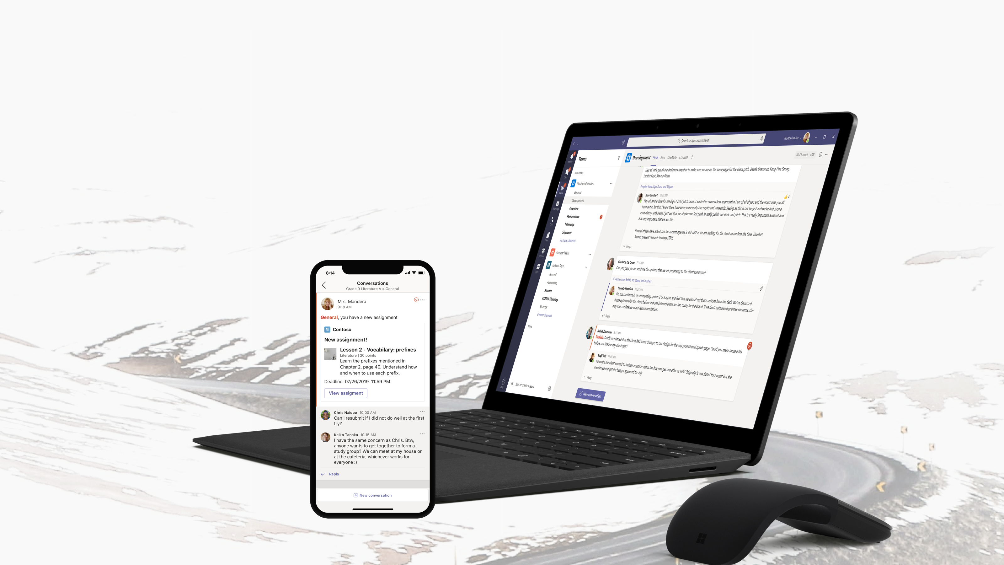
Partner apps in TeamsProduct design with Teams Platform
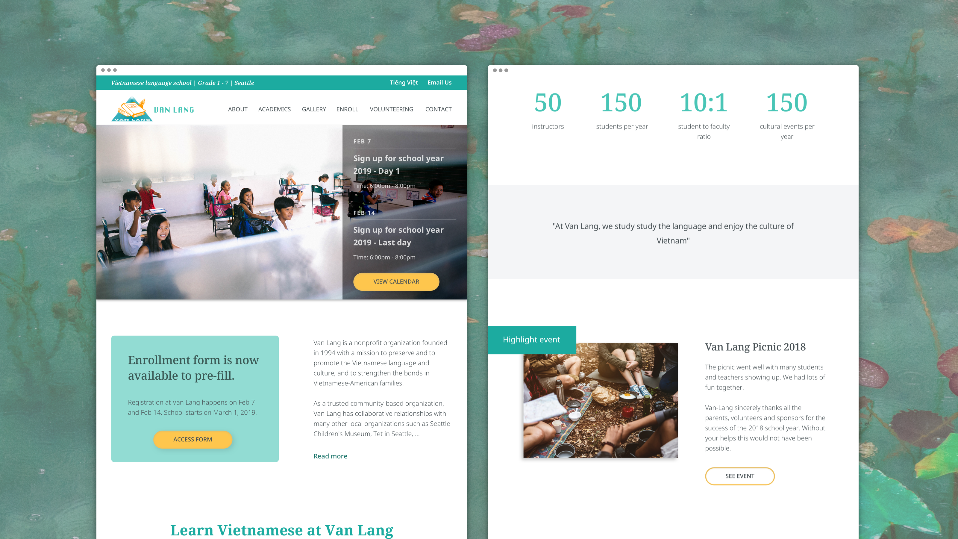
Van LangVietnamese school website redesign
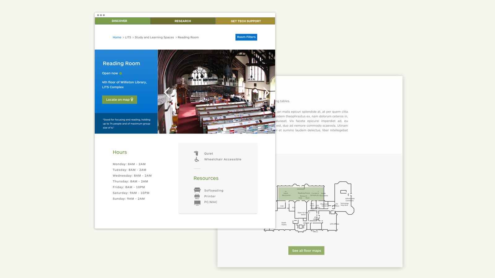
LITS LibraryLibrary website redesign